Archive

Sculpture

DSC_0621

Well I suppose everything is relative. The London art scene’s definition of ‘affordable’ is not quite the same as say, that in Dartford, where poundshop purchases would usually fit that description ie. affordable teabags, affordable hair conditioner. A £300 piece of artwork is the antithesis of this idea of affordability. However in terms of the average art collector, £300 is seen as very reasonable for an original piece. Indeed, having £300 disposable cash to purchase an object purely for aesthetic purposes would, I imagine, propel you instantly into the upper half of the new BBC-approved class categories. An essentially middle/upper class occasion, the art fair always reminds me how many very well off people there actually are in the near vicinity. I often assume that most people there will be like myself, treating it as an exhibition, enjoying the spectacle but unlikely to have saved up enough over the year to warrant even a small purchase. Of course not. The Cannes couples are intentionally conspicuous, swishing winds of material, throwing around their bright lipstick air kisses and desperate-for-attention eye contact, while the old money look down their expensive glasses for a decent investment for little Edward’s future inheritance. Screaming cliches I admit, but I’m not actually playing it that hard, I witnessed both stereotypes myself and I was only there an hour. I don’t mean to suggest this is the majority of guests, of course there are many simple voyeurs who, like me, don’t have money to spend but instead gaze longingly at the works. It’s interesting to watch how this type of visitor is mentally weeded out by the gallery salespeople. You watch their eye movement, clocking each visitor as a potential sale, drinking in their attire, demeanor, money to spend? I feel myself get quickly passed over with a pleasant smile. Thank you – Next!?

DSC_0584

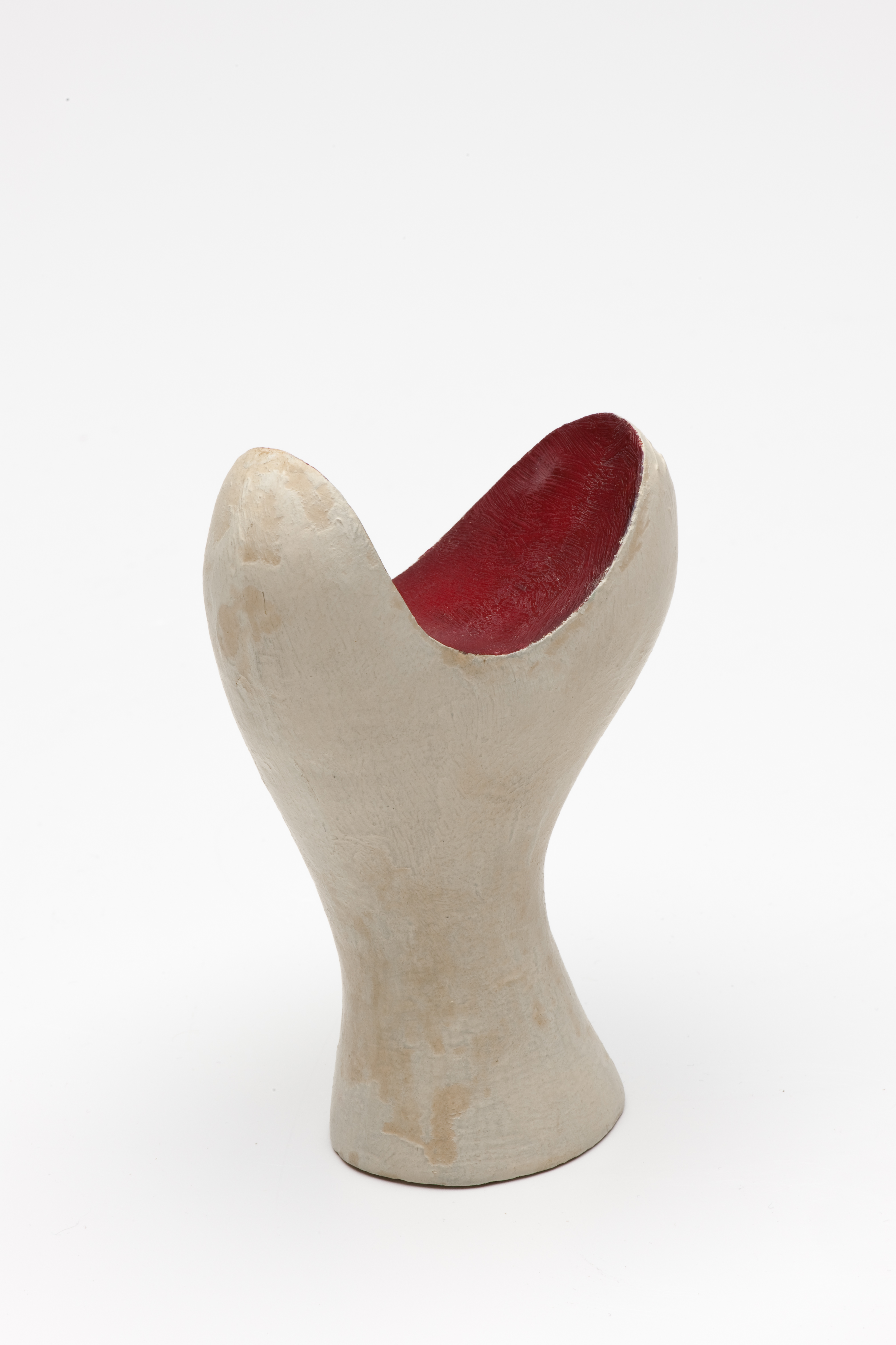
The politics aside, I got 3 free glasses of wine and a very enjoyable walkaround whilst an inhabitant of the huge marquee at the Affordable Art Fair in Hampstead, which in fact presents an intriguingly wide spectrum of artistic styles within a well laid out area. Unlike Frieze, the venue is not too huge, about right I’d say. I left feeling I’d seen enough but had I wanted it there was indeed more, though not enough to make me feel as if I was really missing out by having to depart for my long journey south. Both the size and reputation of the event ensures that it nuzzles comfortably in the centre ground between Frieze and The Other Art Fair; Frieze being an achingly commercialistic haven and The Other being attractively village fete-like. The Affordable Art Fair, although organised and sold by gallery, retains a sense of collaboration, it lets you feel as if you could, and in fact I did, (despite their wily shark senses) have a discussion about the works with the reps. It feels more coherent than The Other, but without entirely losing it’s charm to the business end. The works I saw crossed the spectrum; from intricate pencil drawings to large oils to delicate watercolors and lots and lots of sculpture. Animal and mythological sculpture seems to be having a bit of a revival and the ripples of Damien Hirst’s controversial Tate exhibition can still be seen reverberating through contemporary art – I saw more than a few circular butterfly creations. Prints are certainly in vogue, the retro attraction of old art-deco railway posters styles can be seen time and time again running through modernistic versions and the bold simple techno-graphics seen in popular humour posters of the sort which adorn student’s walls also populate many an art fair partition wall. An evolving installation takes place in the entrance hall involving young women getting covered in beetroot juices whilst tying beets to taut vertical pieces of string (it all seemed a bit dark but I didn’t get to read what it was about), and it’s a shame there wasn’t more installation-style works like this, or at least a bit more evidence of departure from traditional media.

DSC_0581

Seated Old Spot - Ostirelli and Priest (£660)

Seated Old Spot – Ostirelli and Priest (£660)

Adonis and the Boar. The Hunt - Antonio Lopez Reche (£3995)

Adonis and the Boar. The Hunt – Antonio Lopez Reche (£3995)

But although art is slowly becoming more accessible to the everyman/woman, it is still very heavily dominated by the non working classes. Money undoubtedly plays a huge part in this; galleries may be free but taking children out for the day isn’t (travel/food etc.), families without unlimited funds are being priced out of living in London and those who live outside can’t afford to come in. Many more working class people can just about afford to buy art nowadays in comparison to past eras and to many like myself £300 is just about do-able, but affordable? Not for most of the people I know. Yet the works continue to sell, and not at all sparingly. Public arts and funding may have taken a beating in recent years thanks to David ‘we’re all in it together, oh except you, and you and you’ Cameron, but the private money is still there in abundance, just squirrelled further into the little niches of what society we have left. The popularity of the Hampstead incarnation of the fair has grown year on year since 2011, with visitor numbers up to 18,500 in 2012, but a continuous increase in sales could also be seen as somewhat astonishing in this current climate. Recession? What recession?

Jockey and Horse - James Stewart (£3750)

Jockey and Horse – James Stewart (£3750)

DSC_0615

:amp Post - Near the Louvre, Paris - Helaina Sharpley (£895)

:amp Post – Near the Louvre, Paris – Helaina Sharpley (£895)

Idle Hands - Antonio Lopez Reche (£3550)

Idle Hands – Antonio Lopez Reche (£3550)

DSC_0596

Blue Tomato - Vasso Fraghou (£1175)

Blue Tomato – Vasso Fraghou (£1175)

DSC_0595

spitziges gelb 1986/1990-13 - Sigurd Rompza (£1900)

spitziges gelb 1986/1990-13 – Sigurd Rompza (£1900)

DSC_0622 DSC_0616

Heavenly Bodies 3# - Peacock - Louise McNaught (£495)

Heavenly Bodies 3# – Peacock – Louise McNaught (£495)

A perambulator wheel, wire-netting, string and cotton-wool are factors having equal rights with paint

From my own experience, it is rather rare to find an artist (and certainly not an art critic) who has no preconceived ideas of what is art or what is not art; what is good art and what is bad art. I have always felt this to be an indulgent delusion, an often defensive reaction to the simple fact that art is subjective and that contesting this is usually an attempt to force control, system and structure upon the art world. And it works. Just as we used to have the salons, the grand tours, now we have journalist critics, art fairs, the Turner prize. The art establishment is considered by most people to be an authority on art. They have managed to convince a whole populace of the notion that they know best. Not so. It is an impossibility. As with the spoon, there is no right or wrong. I do have some limited experience on which to base this; after spending long hours in lectures and discussion groups at university listening to my art history tutors regurgitate the opinions and thoughts of many others before them, I soon realised that this staid and elitist subject was actually mostly, how do I say this…Bullshit. I’m not sure what I was expecting really, and I don’t doubt my experience there enhanced my writing skills, but it did feel intrinsically snobbish and narrow-minded. The same snobbery I hear from many an ‘educated’ person and repeated back in acceptance by the ‘ uneducated’ ie. non-academics who have been conditioned to believe artistic experience is reserved for a select group of people which doesn’t include them. The belief that to appreciate art you need to know about and/or be able to produce art, is perpetuated throughout the art establishment; trickling down from the publicly educated directors of organisations such as the Tate and National Gallery, and despite the valiant efforts of some to broaden the boundaries of inclusion. Unfortunately, the roots of these attitudes are mired deep in the dusty old vaults of The English Class System and its partner in crime, Entitlement. To cut them at the source requires more than even a barrage of well-meaning education programmes.

This ranting tangent does in fact have some relevance to Kurt Schwitters, who was himself something of a non-conformist, challenging the traditional status of paint in a way many would have seen as blasphemous for an artist. The Nazis certainly saw it this way, branding Schwitters ‘degenerate’ and forcing him to flee his native Germany in exile. Through developing the Merzbau (a large sculptural installation first constructed in Hanover, then re-explored later in Norway and the Lake District; utilising the very structure of a house as part of the work), Schwitters developed a term to describe his artistic practice and beliefs: Merz. Essentially Merz encompasses the basic principles of what I also believe – that is, it is not only traditional techniques which can produce works of art; objects all around us are both art materials, art medium and art pieces in themselves. Instead of using line for line, he used materials and objects to convey their own qualities in accordance with his requirements; wool to express softness, metal to communicate line, and specific arrangements of 2D materials which denote areas of space, in a manner reminiscent of Richard Hamilton.

Merzbau (Teilansicht: Grosse Gruppe), 1932© Sprengel Museum Hannover. Pro Litteris, Zürich

Merzbau (Teilansicht: Grosse Gruppe), 1932
© Sprengel Museum Hannover. Pro Litteris, Zürich

Picture of Spatial Growths - Picture with Two Small Dogs 1920-39 Image courtesy of Tate

Picture of Spatial Growths – Picture with Two Small Dogs 1920-39 Image courtesy of Tate

A large proportion of Schwitters’ work is made from collages of used paper elements from his own, or other people’s, lives. It makes sense. Why should art be a copy of life? Why not made from life; life as it has been lived? After leaving Germany for Norway in 1940, his work flourished as he started construction of two new Merzbau’s, but not for long. As the Nazis advanced across Europe to Norway, Schwitters decamped yet again, this time to Britain, Edinburgh to be precise, where he was promptly classed as an ‘ enemy alien’ and sent on to an internment camp on the Isle of Man. Despite the incarceration, a modest silver lining became apparent; the camp allowed, nay even encouraged, the pursuit of the arts. Whilst at the Isle of Man, Schwitters engaged in prolific production, using whatever materials he found laying nearby. The results tell a story, a lesson in imagination and creativity. Pieces made from old newspapers, painting on linoleum; the things most people would class as rubbish and yet Schwitters could see their potential for expression and their uses as communicators of formal aspects. Pieces of seemingly random ephemera are actually carefully placed and thoughtfully chosen, such as in Half-Moon, where a pink flamingo takes centre-stage but conversely, it’s semi-translucence suggests it’s presence as negligible. After being released from the internment camps after 16 months and with over 200 works completed whilst inside, Schwitters moved to London in 1941. His later works begin to move away from the sharp lines of paper and wood, and towards the suggestion of a fascination with the curve. In a lively dialogue between the canvas and the forms protruding form it, he began to move further and further outwards from the flat surface, eventually going so far as to leave the canvas altogether and produce freestanding sculptures. At this point, Schwitters is encompassing all aspects of his work at once; painting (of which he produced many traditional representative pieces, sometimes to make a living, sometimes as artistic practice), sculpture, and his own unique marriage of the two.

doremifasolasido c.1930Private collection. Image courtesy of Tate

doremifasolasido c.1930
Private collection. Image courtesy of Tate

Untitled (Opening Blossom) 1947© Centre Georges Pompidou, Musée national d'art moderne, Paris / DACS 2012. Image courtesy of Tate

Untitled (Opening Blossom) 1947
© Centre Georges Pompidou, Musée national d’art moderne, Paris / DACS 2012. Image courtesy of Tate

In 1945 Schwitters moved to the Lake District and began working on a new Merzbau. Continuing the semi-sculptural collage techniques, he began working on a wall relief, incorporating nearby objects and intending to extend the work throughout the abandoned house in which it began. Sadly, his death at this point meant that the installation was never completed, but the subsequent efforts to transport it and the battle over its purchase, denote the importance Schwitter’s work has to many people. As for me, anyone who challenges the traditional closed-mindedness of the art world is as close as you’ll get to a hero in my book.

Untitled (Quality Street) 1943© Kurt und Ernst Schwitters Stiftung, Hannover, Sprengel Museum Hannover and DACS 2012. Image courtesy of Tate

Untitled (Quality Street) 1943
© Kurt und Ernst Schwitters Stiftung, Hannover, Sprengel Museum Hannover and DACS 2012. Image courtesy of Tate

All images are by Kurt Schwitters

Schwitters in Britain is showing at Tate Britain until 12th May 2013. See here for more information.

If you’ve strolled down Exhibition Road lately you will likely have noticed the series of strange vertical forms rising up like alien beings from the uniformity of the newly landscaped area. Tony Cragg’s sculptural series for the London 2012 Festival are particularly intriguing if, like me, you happen to just spot them on passing. The first form caught my eye at about a quarter of the way down the hill, with the Serpentine Pavilion still fresh in my mind. Throwing off in my direction sharp beams of the late summer sun from its silken metal, it appeared at once from post-modern camouflage to stick out like a sore thumb. Once seen, I couldn’t stop looking. There seems to be some human fascination with this type of form, reminiscent of flowing liquid and molten metal. A slideshow of related scenes from various films clicked instantaneously through my memory: T-1000 in Terminator 2, Water Tentacles in The Abyss, the playful material in Flubber and the time travel liquid tubes in Donnie Darko – a strange mix, but all in some way reference our preoccupation with this malleable, elongated form.

Ambling further down the now part-pedestrianised famous road, I continued to muse upon the possible origins of this fascination when I came suddenly face to face with a different, but undoubtedly related object. This brushed bronze incarnation is certainly less flashy, seeming to reference the traditional museum history of the area, as opposed to its mate, firmly rooted in modernism. Bringing to mind the human element rather than sci-fi film history, its top section resembles two large sculptural carved heads, almost African in style. It is imposing; powerful and dramatic.

A few more steps down the hill and we meet work number three. By now I realise there is more to come, but how many remains a mystery. Retaining the element of the vertical lift, it propels skywards, as if reaching to an invisible hand. Through perforated metal it takes a pear shape as its base form, discarding the previous undulatory style and instead projecting arching limbs. Like an alien dancer the piece is infused with movement, your eye drawn back and forth; darting through material and void, along horizontal and then vertical contours.

Piece four returns to form. Again in brushed bronze but as a decidedly more abstract structure, it embodies the rippling curves but is a wall rather than a tower; instead of leading you invitingly upwards, it blocks the way with an element of menace. In the centre sits a small void, a peephole through to what lies behind, as though mocking your instinctive desire to see beyond it. The edges, suggesting a darker element, often finish in vicious points rather than continuing the flowing lines, perpetuating the sense of sharp and impenetrable.

I move on. The fifth and final work is reminiscent of Damien Hirst, the presentation of the pinnacle of adoration. Sparkling in gold finish and immense in mass, it sits adjacent to where Exhibition Road crosses Cromwell. A point of high foot traffic, where the sculpture’s relative perceived importance is proven by the surrounding tourist throng. Ironically, rather than dazzling me, it reminded me instantly of excrement – Gary Hume’s The Shit flashed into my memory, similar in form but here swathed with gold.

Gary Hume – The Shit, 2009

Perhaps Cragg intended this interpretation, a comment on our money-obsessed society? Maybe we are meant to be unsettled by towering shiny stainless steel and bronze shapes then finally, just as we get used to these strange beings, we see one clad in that very thing we worship above all else. Gold. Whether it is a shit or not, it’s still gold. A valuable gold shit. Suddenly these works spoke to me about public delusion and political misinformation. Corporate robbery dressed up as benevolence, slavery masquerading as philanthropy. In the midst of the tourist crowd, clamouring for the gift shops, I can’t help thinking that all that glitters may not be gold…